Brand
Logo and brand assets
The Alpue mark in every colour, ground and format you should need, and the few rules that keep it looking like ours. Take what you need; if in doubt, ask.
The mark
Ripple
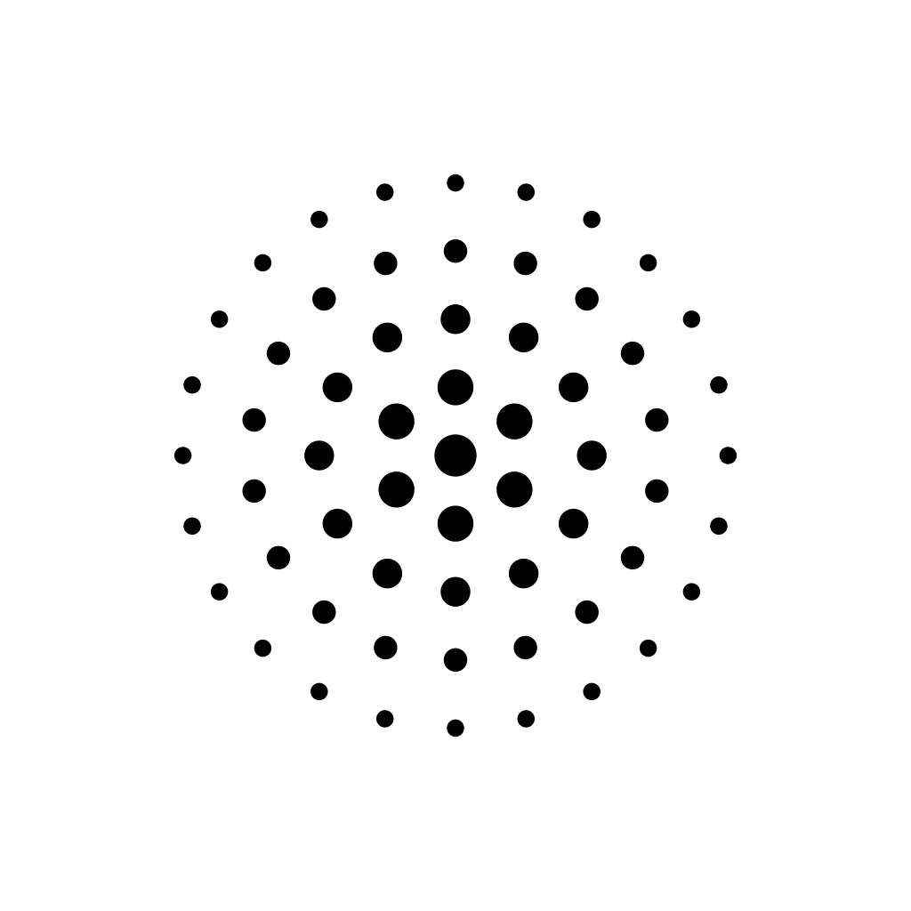
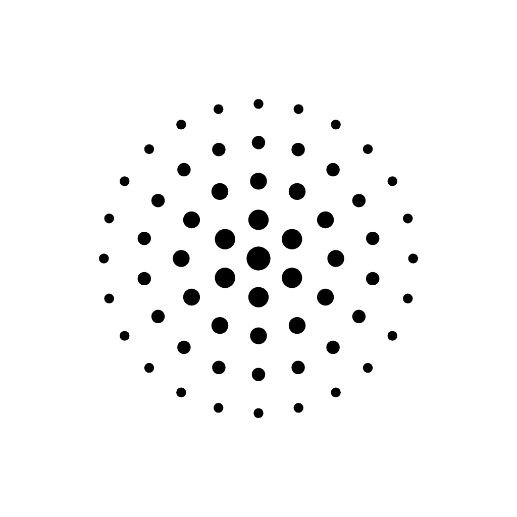
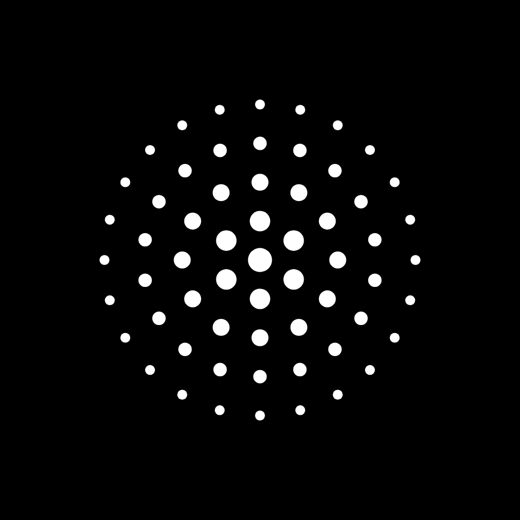
Five rings of dots radiating from a solid centre, each ring smaller and lighter than the last. It reads as a signal propagating outward, which is closer to what we do than a filled shape would be: one piece of software, felt further and further into an organisation.
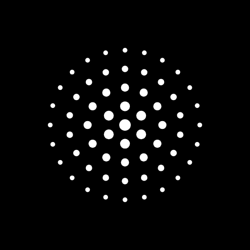
It is monochrome by design. Black on light grounds, white on dark ones, never a colour. The mark is the whole logo; the wordmark beside it is set in type, not drawn.
Standard clear space
Ready to place
The everyday set. Enough margin that nothing needs to be added around it, little enough that the mark still reads at a glance.

Extra clear space
More air around it
The same mark with more room around it, for places that crowd a logo: app tiles, avatars, anything that crops to a circle, or a row of partner logos where ours would otherwise look the largest.














Using it
Four rules, none of them hard
Clear space
Keep other elements at least a quarter of the mark's width away from it on every side. Every file on this page already includes that margin, so placing it edge to edge against text is the only way to get this wrong.
Minimum size
Below about 48 pixels the outer rings blur into grey. For favicons and other tiny placements we draw a reduced version with fewer, fatter rings; ask for it rather than scaling these files down.
Colour
Solid black or solid white, whichever has the stronger contrast against what is behind it. On photographs, prefer the white mark over a darker area of the image to the black mark over a busy one.
Leave it alone
Do not rotate, stretch, outline, recolour, add a shadow or glow, place it in a circle or rounded tile, redraw the dots, or pair it with a different typeface for the wordmark.
Colour
Black, white, and three greys
There is no brand colour. The site, the documents and the mark use ink on paper, and the greys exist only to rank text. Anything that needs colour, a chart, a status, a warning, takes it from its own context and not from us.
Ink
#000000
Headings, primary text, the mark.
Ink 2
#4A4A4A
Body copy.
Ink 3
#8C8C8C
Captions, eyebrows, metadata.
Line
#E2E2E2
Hairline rules between cells.
Paper
#FFFFFF
The ground everything sits on.
Typography
Inter, and only Inter
The wordmark is the word alpue, lowercase, set in Inter at weight 200 with the letters tracked one percent tighter, sitting beside the mark at roughly cap height. Inter is open source, so anyone can set it exactly; nobody needs to redraw it.
Headings are bold with tight tracking, body copy is regular at 15 to 17 pixels, and small labels are semibold, uppercase and widely spaced. Nothing is italic, nothing is rounded, and nothing is centred that does not have to be.
Need something this page does not have?
A different size, the mark and wordmark together as one file, or a second opinion on a placement: write to us and we will send it the same day.